Apple’s new design philosophy, Liquid Glass, is set to debut with the official launch of iOS 26 in the fall. This design language will bring significant changes to all of Apple’s major operating systems, including iOS, the most crucial one.
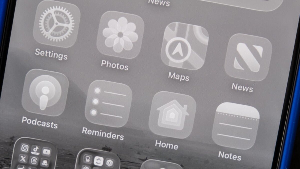
Liquid Glass introduces a new approach to software design by embracing layers, creating a glass-like effect that allows users to see through elements like buttons and controls. This transparency adds a futuristic touch to the interface, making it more visually appealing.
One of the key features of Liquid Glass is the streamlined interface, which aims to show as much information on the screen as possible. Controls in apps like News, Messages, and Music now minimize into icons that can be tapped when needed, providing a clean and uncluttered look.
Overall, Liquid Glass offers a fresh and modern design aesthetic that enhances the user experience on Apple’s operating systems. With its transparent elements and streamlined interface, iOS 26 promises to be a visually appealing and user-friendly update.
I found that the streamlining in certain areas went a bit too far. Take the Camera app, for example. When you first open the app, you now only see the option for photo or video. However, there are actually other modes that you can swipe through, they’re just hidden by default. While having just photo and video modes may make things simpler for most users, those who use the extra modes may struggle to remember that they’re still available without any visual cues.

Another area I hope Apple continues to work on is the appearance of the Messages app. Instead of a header with the contact’s profile picture, name, back button, and FaceTime button, there are now floating bubbles at the top of the screen. Depending on what’s behind these bubbles, you may either see straight through to the messages or have the interface fade out to show controls.
Personally, I take a lot of screenshots as a journalist. I find the extra clicks needed to save a screenshot in the new setup to be a bit cumbersome.

You can customize Liquid Glass
If you feel like there’s too much glass in your Liquid Glass, you have the option to change it. Aside from adjusting transparency, you can also customize app icons. While the ultra-clear look garnered attention after WWDC, Liquid Glass icons are not enabled by default, giving users the choice. This approach helps ease the transition for users who may not be ready for the full Liquid Glass experience.

I believe Liquid Glass represents an interesting design evolution for Apple. I appreciate the move towards software design that mimics real-life physical objects. Currently, adjustments to the visuals can be made in the Accessibility menu, but I anticipate Apple will address many issues before the official iOS 26 launch. That’s the purpose of a beta, after all.
If you’re curious about trying Liquid Glass on iOS, macOS Tahoe, iPadOS, tvOS, or watchOS, consider signing up for the Apple Beta program.
Topics
Apple
iOS